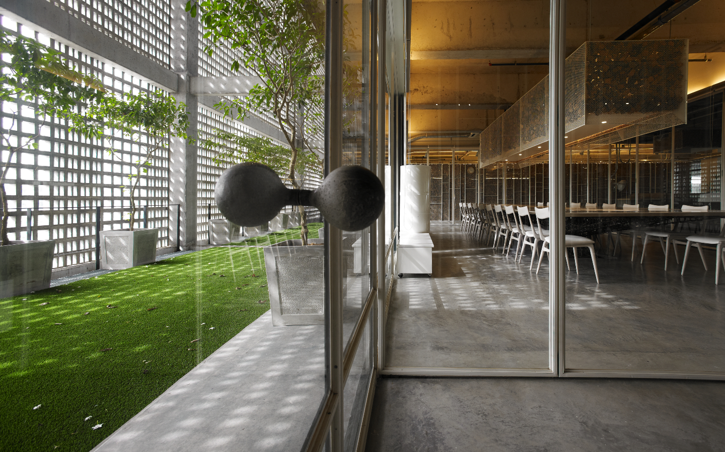
An open-air area for meals and breaks and fully collapsible glass walls ensure maximum airflow and circulation (All photos: Tujuan Gemilang)
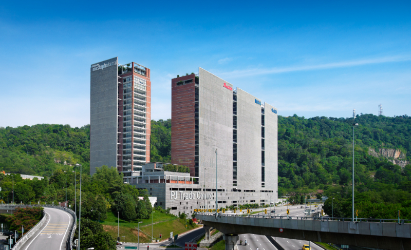
The PJ Trade Centre in Petaling Jaya’s Damansara Perdana is not one of the Klang Valley’s latest or edgiest commercial developments but, remarkably, it barely shows its age. One wonders whether that is because of the brick façade, which lent the buildings a retro aesthetic right from the get-go, or the way the cement panels have softened with time? Ah, wait — might it be the greenery that surrounds the building has grown and matured over time?
It is likely to be a combination of all three, which has given tenants and visitors many years of joyous use. The outdoor area is dotted with trees, which today tower almost 15m high and provide a good amount of shade. Under the trees are benches that see a great deal of activity during mealtimes. Indeed, there are not too many offices in our city that offer this opportunity. In the mornings, it is especially pleasant as the area is bathed in sunlight, and often, a powdery soft breeze.
In seeking for ideas to design of its on-site office, PJ Trade Centre’s developer Tujuan Gemilang looked to the atmosphere it created for inspiration — the blurring of boundaries between indoor and outdoor spaces and a minimalist take complemented by a youthful, industrial-inspired chic. This timeless approach means the office, which was completed in 2009, has aged remarkably well from a stylistic perspective.
pjtc_eastern_facade.jpg

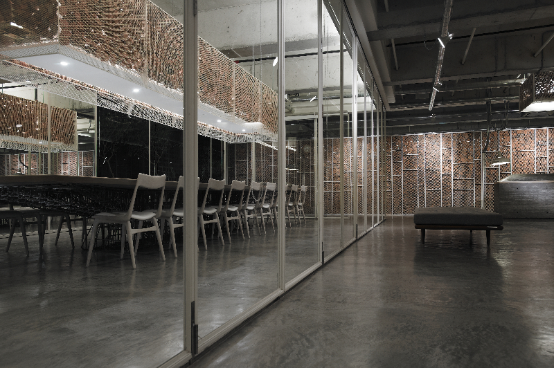
“The design inspiration for the office was a space that reflected our company mission and values with an aesthetic that is understated, elegant and tasteful,” says managing partner Peter Chan. “And this includes the use of simple local materials crafted in creative ways to produce something that is unique and appealing.” Dominated by cement and pale wood, which lends the space a Japanese-inspired feel, the office fits Tujuan Gemilang’s sales gallery, workspaces that once hosted the company’s entire team of 15, as well as a larger-than-ordinary meeting room.
This, Chan says, was a specific request. “One of the most important requirements was a meeting room that would be at the heart of the office, where the designing and crafting of the products could be seen by visitors and our staff. Good design is the core of the company — that is how our company and projects are different and stand out — and we wanted that to be exhibited at the centre of the office. A bit like an open kitchen in a restaurant,” he adds.
Custom-designed for the space, the table is made of cement, treated so it is soft to the touch and completed with wood panelling. Underneath, a complex network of wrought-iron rods — all recycled — holds the entire thing up. Hanging above it, specially designed metal cages temper the effect of lightbulbs in a most interesting way as they are filled with pieces of brick that were once used in Tujuan Gemilang’s old office. Similar structures are used to shield the private workspaces, located on the left and right of the central sales gallery, which sees a good number of visitors during the course of the day.
pjtc_154.jpg

Although the Tujuan Gemilang space was built well before our post-pandemic approach to office design changed drastically, there are some aspects that were quite ahead of their time. For example, a section at the rear of the office — which is wider lengthwise than it is deep — is designed to be an outdoor dining space for staff to score some fresh air while having their meals. It is slightly rowdy with the sounds of traffic from the LDP below, but that is not impossible to ignore. A small pantry is located here, too, concealed for privacy. The constant ventilation makes this a perfect location for the toilets too.
The ceiling-to-floor glass walls at the front and rear of the office can be completely opened, which the team does frequently so the air inside is never stale — in light of the pandemic, this is hugely advantageous. Easily collapsible and adjustable partitions are part of a modular, forward-thinking design that considers an office as a versatile space for a multitude of activities. “The office is essentially open-plan and very flexible. The sales gallery is just one big space and can be easily configured to suit various needs. The walls of the meeting room are folding glass partitions that can be unfurled and, for the workspaces, the mesh partitions can be easily modified,” Chan adds.
Even with the threat of Covid behind us, we have developed a stronger than ever desire to be connected to Mother Nature — if it was a mere want before, it is actually the safer option these days. Then, as is the case now, Chan says this reinforced link from outside to inside has consistently remained the staff’s favourite aspect of the office.
pjtc_159.jpg

“The ability to view the wonderful forest at the front of the office and walk out to the corridor for some fresh air; the outdoor space at the back, where they can sit and have lunch or just take a break; and the meeting room, where we can enjoy both the early morning sun filtering through the vent block screen as well as the afternoon sun shining through the courtyard — everyone loves this.
“We can see and hear the rain coming down, even the whistling of the blowing wind! We are very connected to nature, and that helps in our quest to be creative and innovative as we craft our projects.”
Many designers talk about future-proofing offices to be nimble, agile and supportive of the changing needs of their tenants, but rare is the space that actually achieves this.
This article first appeared in issue No. 106, Winter 2022 of Haven.


