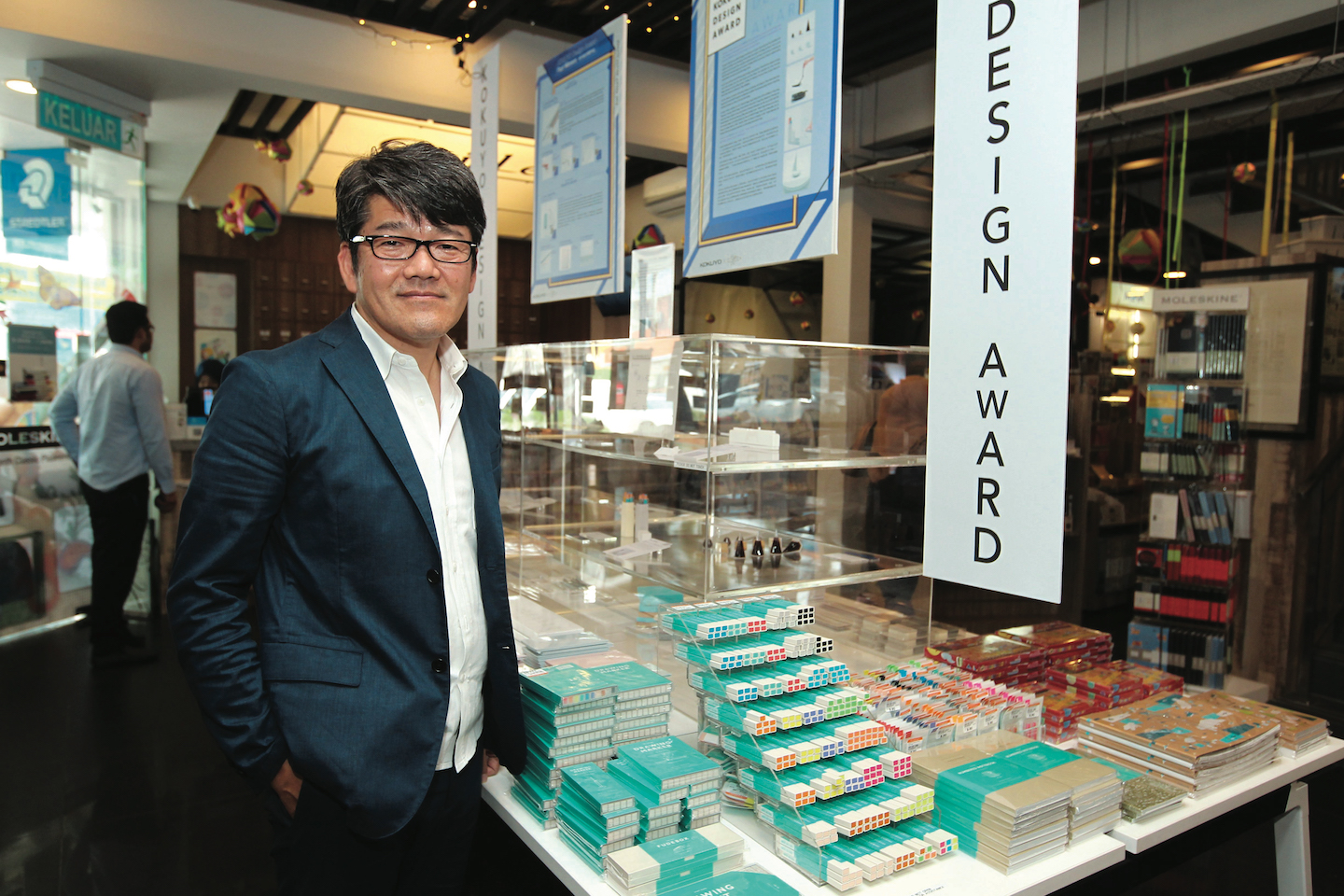
Kokuyo Design Award director Takeshi Fujiki (Photo: Suhaimi Yusuf/The Edge)
Epitomising the proverb about little acorns and mighty oaks is Japanese stationery and furniture giant Kokuyo. Its humble beginnings date back to Osaka in 1905 with general ledgers and, over the ensuing 113 years, it grew into a household name in cutting-edge office paper supplies and stationery, as well as innovative furniture.
Among the hallmarks of ingenious design are simplicity of concept and application, qualities quickly affiliated with Kokuyo as it released products such as the Harinacs staple-free stapler, a nifty piece of engineering that replaces the traditional metal brackets with a punch-and-fold principle for limited sheets of paper. With a growing reputation as an innovator, it was only natural that the brand create a design award to encourage and celebrate similar traits in others.
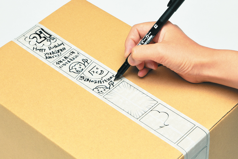
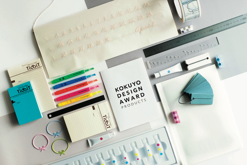
In recent years, the award’s premise has reflected an evolution in our demands of design, moving from the strictly functional to a more emotional approach, in keeping with a desire for design to naturally integrate into lifestyle. An example of this is the 2015 Merit Award winning product, A String of Beautiful Days, a calendar whose individual dates are sewn with a single thread into a sheet. Users mark the passing of days by pulling on the relevant thread, an absorbing, contemplative process that allows them to reflect on the day gone by. The 2016 Merit Award went to Manga Packing Tape, a parcel tape printed with comic panels, speech bubbles and speed lines for senders to include a little story for, or convey a feeling to, the recipient.
Kokuyo_200818_PP

“The evolution was striking in recent years and we had to adapt accordingly,” says Kokuyo Design Award director Takeshi Fujiki. He is at the CzipLee stationery store in Bangsar — which stocks Kokuyo products — to open this year’s award to Malaysian designers. “The trend set by consumers has diverted from high utility to lifestyle integration. The demand is for more sensitive and delicate designs, which Japan today does very well. But to ensure that we aren’t only designing in response to the Japanese market, we look to universal sentiments of design and appoint internationally recognised judges.”
Entries for this year’s theme, Beyond Boundaries, will be judged by the likes of Yasuhiro Suzuki, a designer who has exhibited everywhere from London and Reykjavik to Moscow and Berlin; Oki Sato, founder and CEO of design office Nendo; and Ryosuke Uehara and Yoshie Watanabe, co-founders of graphic design company KIGI.
“Design has to be sensitive and have a certain degree of commercial appeal, and I think we have a balanced outlook with our choice of judges,” continues Fujiki. “I personally wouldn’t categorise Suzuki as sensitive but he is capable of very poetic expressions, while Sato has a more business-like perspective. Good design comes from astute observation of things that are dear to us. It’s not solely based on performance or aesthetics. It has to be natural but adaptable, acceptable and usable. And I think with our mix of judges, we will be able to achieve that in selecting this year’s winners.”
Kokuyo_200818_PP

Last year’s awards drew in 1,326 entries from 53 countries and, despite the cultural differences, the award director found that good design is universal in appeal and application. He points to the Manga Packing Tape as an example. It was created by Kazuhiro Minami who wanted to enliven the parcels he sent to his mother with a cheerful, personal touch. This Fujiki juxtaposes with Nameless Paints by Yusuke Imai and Ayami Moteki that won the Grand Prix in the 2012 Kokuyo Design Award and multiple design honours around the world. The conceptual product removed the rigid, even prejudiced take on colours by presenting solo and combined primary colours to free the imagination of users and allow for greater experimentation.
“When I was a child, I used to unquestioningly use [what I had predetermined as] ‘skin colour’ when painting people’s faces,” Moteki said in an interview after winning the award. “When I think about it now, it’s somewhat strange.” There are no white or black paints in this set, only varying ratios of yellow, red and blue. The wide gradient of skin tones is a complex subject for children especially, and this tactic pushes them to consciously consider such issues when painting.
“Superior design is not something aesthetically beautiful, but a product with enduring meaning,” says Fujiki. “Every time we receive new entries, I am amazed by the originality. Many of them have ideas I could never even have imagined. This year’s theme, Beyond Boundaries, celebrates that and looks for products of universal meaningfulness. It comes down to philosophies that will prevail. Take the Eames Lounge Chair and Ottoman. It was created over 60 years ago and was criticised by some for being too modern, but we’re still using it today and upholding it as the pinnacle of design because at the end of the day, it is an excellent, well-built, thoughtful product.”
This article first appeared on Aug 20, 2018 in The Edge Malaysia.


