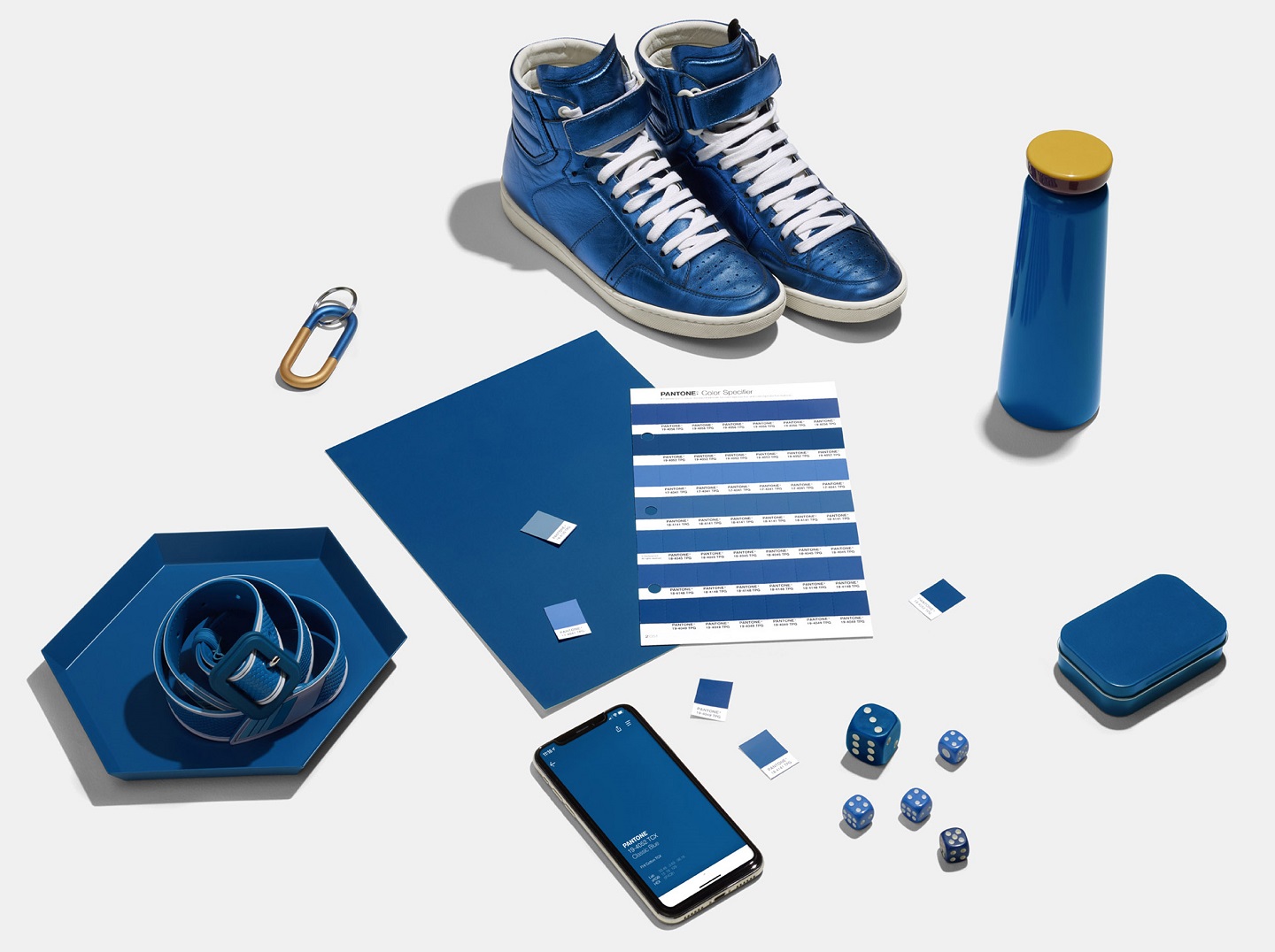
Classic Blue is a hue that is both genderless and seasonless, which makes it both accessible and desirable (All photos: Pantone)
American colour company Pantone is feeling blue but in a way that instils calm, confidence, credibility and connection. Following a trend-forecasting stunt since 1999 that’s closely watched by the media, the company has named Classic Blue, or Pantone 19-4052, this year’s ‘universal favourite’.
Mind you that the blue of 2020 is not Cerulean (Miranda Priestly has taught us well; to revisit her impactful monologue, see below) – the company’s first pick back in 2000. Or Blue Turquoise, which dominated retail racks in 2005. Classic Blue is darker, a shade that matches the sky at dusk, and thus, resonated with many people.
Think colour of blueberries, a Pepsi can and the sky when it’s “that beautiful colour at the end of the day”, said Leatrice Eiseman, the executive director of the Pantone Colour Institute, which advises companies on human responses to colour. Blue has always been associated with sadness but Classic Blue is emblematic of heritage – a hue that is both genderless and seasonless, which makes it both accessible and desirable.
“A boundless blue evocative of the vast and infinite evening sky, the Classic Blue encourages us to look beyond the obvious to expand our thinking; challenging us to think more deeply, increase our perspective and open the flow of communication,” Eiseman added.
This is the first time Pantone has made the announcement with multi-sensory bonuses. An electro-pop track called Vivid Nostalgia as well as a berry tea – all inspired by Classic Blue – will be available for purchase.
If you thought the pick of the year had anything to do with endorsing a particular American political party, you’d be wrong. Pantone’s representatives have denied all associations with impeachment, the election or Brexit.
Classic Blue aims to provide a sense of refuge, fulfilling a desire for a dependable and stable foundation – something all of us probably lack and desperately need right now.
For more info, see here.


