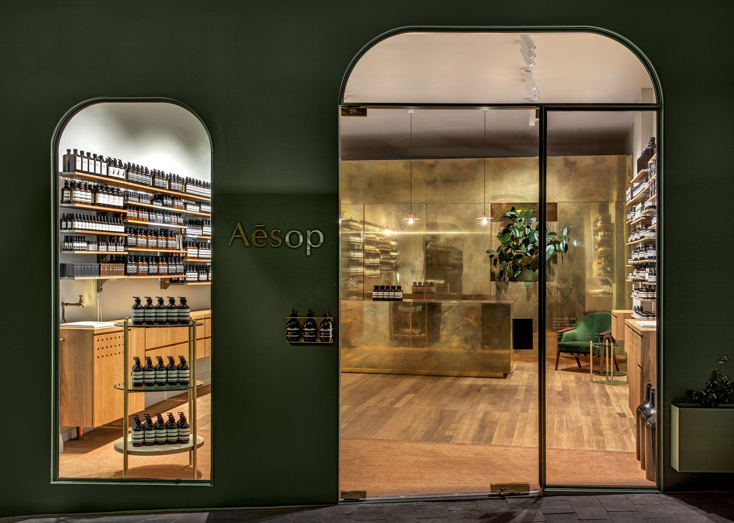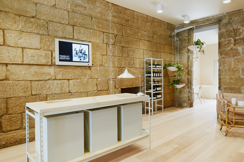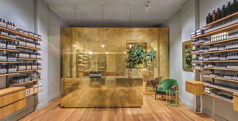
Each of Aesop’s stores is custom-designed according to the character or history of each location (All photos: Aesop)
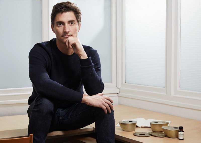
Though he currently calls Sydney home, Henry Wilson cut his teeth in design in Canberra, where he graduated from the Australian National University School of Art with first class honours in visual arts, specialising in woodwork. An exchange programme to the Rhode Island School of Design and the subsequent pursuit of his Master’s degree in Eindhoven, Netherlands, exposed him to design philosophies.
Flea markets in the Netherlands and Germany fascinated him. “Discovering well-made things from the past was like tracing ancestors of contemporary design,” reads Wilson’s biography on his website. “I recognise that the anthropology of design has a linear narrative and that ideas today are developments of those that have come before. It is an evolutionary process of refining, learning and improving. Well-made things last. I believe this is one of the simpler forms of sustainability that we can hope to achieve.”
Enduring design stems from the society it is born to serve in and within the clean aesthetics he propagates is a firm emphasis on functionality and strength. “My work combines a rational, democratic utility with an element of sculptural expression,” says Wilson. “There is clear form and function in my products, but it’s important they also have feeling. I strive to reach a simple objective with a sense of honesty and poetry. There is an awkward beauty that comes from something made by hand. I like to explore how imperfection can be introduced into an industrial process, to make something at scale that retains a sense of individual charm.”

Studio Henry Wilson was opened in 2012 and purveys premium furniture, lighting and accessories. The accessories are fashioned from bronze, aluminium, brass, stone and leather, the first two achieved with forging a close relationship with a local foundry. Wilson also has some of his work on permanent display at the Museum of Applied Arts and Sciences in Sydney and the Art Gallery of Western Australia in Perth.
Among the studio’s most iconic commissions is an ongoing collaboration with Aesop. A year after he launched his studio, Wilson was approached by the Australian skincare brand to design its new Sydney boutique, Aesop Balmain. “We share a common sensibility and approach to design, as well as an understanding of the impact of design on those who engage with it,” says Dr Kate Forbes, Aesop’s general manager of marketing and innovation, on engaging Wilson.
It was a golden opportunity for the designer, who respected the brand’s commitment to quality and innovation. “It always felt like design solutions were on the table. It was not a hurried process, it was something that we all knew had to be thought through,” he says.

Balmain, an affluent neighbourhood in inner west Sydney, provided plenty of graceful design cues for the designer to incorporate into the boutique. Aesop’s store design philosophy has always been to sincerely and authentically respond to local contexts. Shipping and manufacturing industries dominated Balmain in the early 1900s until gentrification transformed the harbourside district in the 1960s. Wilson celebrated the architecture and character of the cavernous space by pairing the original rough-hewn walls formed by sandstone blocks with pale wooden floors, steel-edged shelving and a wealth of natural light to mirror the natural aesthetic preferred by Aesop.
So successful was this collaboration that he was later invited to do the same with the Aesop Crows Nest boutique in Sydney and act as design partner at its Salone del Mobile exhibition in Milan in 2017. Most recently, he spearheaded the brand’s venture into a home-care range by designing its first object: a brass oil burner for aromatherapy. Crafted from solid brass using a lost wax casting process — the ancient technique uses wax moulds to cast metal objects — the intentionally asymmetrical object weighs a substantial 1kg and would develop its own individual patina over time as the brass responds to use.

“After a considerably lengthy design process, we eventually settled on brass for its superior heat transfer properties, its tactility and warmth, and its long affiliation with candlelight,” says Wilson. “The challenge was to create an oil burner design and shape that was utilitarian yet beautiful, reflecting Aesop’s minimalist aesthetic and its strong eastern philosophy regarding design, which would complement most interiors. The design of the Brass Oil Burner was inspired by the simple act of pouring molten brass into a vessel — the strength, richness of colour and the beauty of the metal flowing into a unique shape.”
Wilson’s interior work is best reflected in the Aesop Balmain and Aesop Crows Nest boutiques in Sydney. Designs by Studio Henry Wilson can be viewed here. This article first appeared in issue no 89, Autumn 2018 of Haven.


