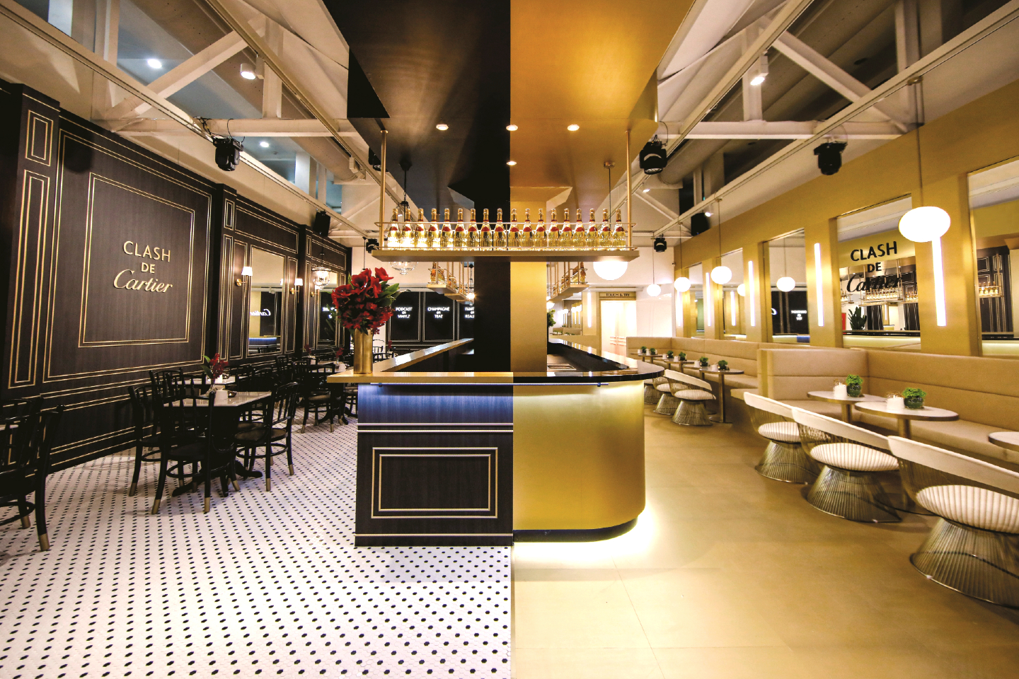
The café's duality was demarcated by the split personality of a central bar (All photos: Cartier)
There were drinks and nibbles that invited you to sip and sup, but these were not catalysts for the mind-bending experience of Cartier’s pop-up world. Alice might have tumbled down a rabbit hole and adventured through Wonderland with the aid of cake and potions, but our immersion into fantasy began with a ride up in a red elevator.
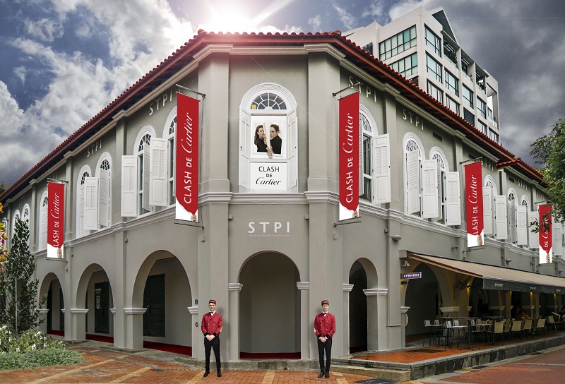
For one weekend late last year, Cartier took over the STPI Creative Workshop and Gallery in Robertson Quay, Singapore, to transform the restored 19th-century warehouse into the Clash de Cartier Studio, following a successful debut in Paris. The immersive installation — so comprehensive that even the heritage building’s façade donned the mantle of the French maison — was its largest pop-up project so far in Southeast Asia and proved an experiential expression of the brand’s imagination and attention to detail.
cartier_stpi.jpg
It was well worth the fuss, culminating in a star-studded bash graced by Malaysian actress Nur Fazura; Singaporean actresses Rui En, Rebecca Lim and Sheila Sim; and South Korean actor Ji Chang-Wook, whose fans circled the block hopefully late into the night. Music thumped, champagne flowed and hors d’oeuvres made the rounds, but the undeniable belle of this ball was Cartier’s inimitable flair for design.
The welcome
Did we mention a red elevator? Cartier left no corner untouched. The ordinary lift of this riverside gallery was washed in the maison’s signature hue, symbolically and literally transporting a steady stream of guests to a microcosm of its world. The doors opened to reveal red-jacketed bellhops bearing trays of champagne in a foyer that had been converted into a café unlike any other.
The café
A brand loyalist will tell you there’s a Cartier collection for every mood. The French house did not earn its repute as the jeweller of kings by subscribing to a single school of design. Instead, guided by tenets such as grace and harmony, it leaps from classic or contemporary to downright edgy, donning personalities as it pleases. The café encapsulated that nuanced character, with two expressions occupying a single space.
cafe_5.jpg
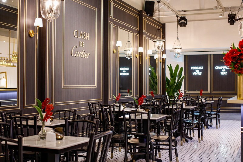
One half was decked as a classic French café with a monochrome mosaic floor, marble tables and glass lamps with old-fashioned linked chains while the other was a plush modern bistro accented in gold and white with cushioned booths, sumptuous stools and pendant orbs for lights. This duality was demarcated by the split personality of a central bar — the classic half featuring a gold top perched on a gilded wooden body while the side serving the bistro wore a glossy black counter atop a gold frame.
Chambers of inspiration
The clacking of a typewriter preceded entry to the bookstore, where tall white bookcases housed tomes of varying genres. Visitors took personality quizzes on iPads, then brought over the results to one of two poets who typed out a customised haiku for their keeping.
In direct contrast to the hushed reverence of the literary section, the record store pulsed to several beats. A red feature wall bore a rack of vinyl records promoting a Clash de Cartier playlist curated by sound designer Michel Gaubert. A mishmash of genres, from classic to rock and reggae, played simultaneously but could be individually appreciated by standing beneath a glass “sound shower” that concentrated the music.
record_store.jpg
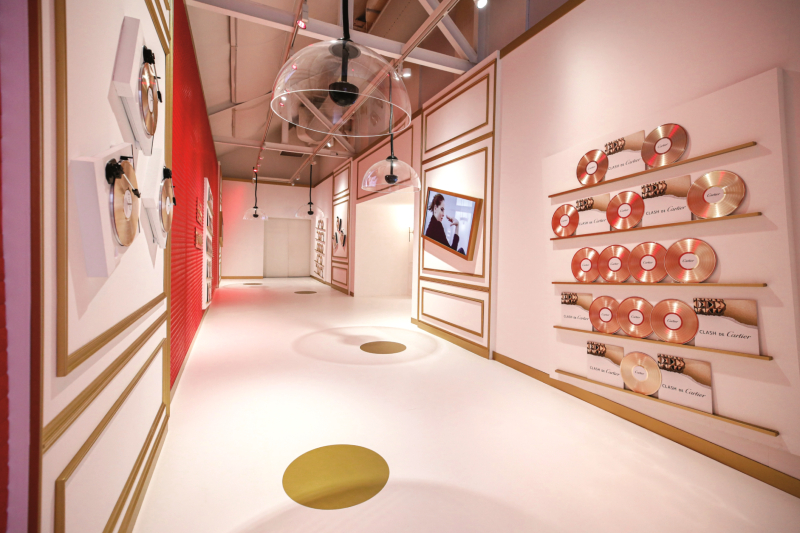
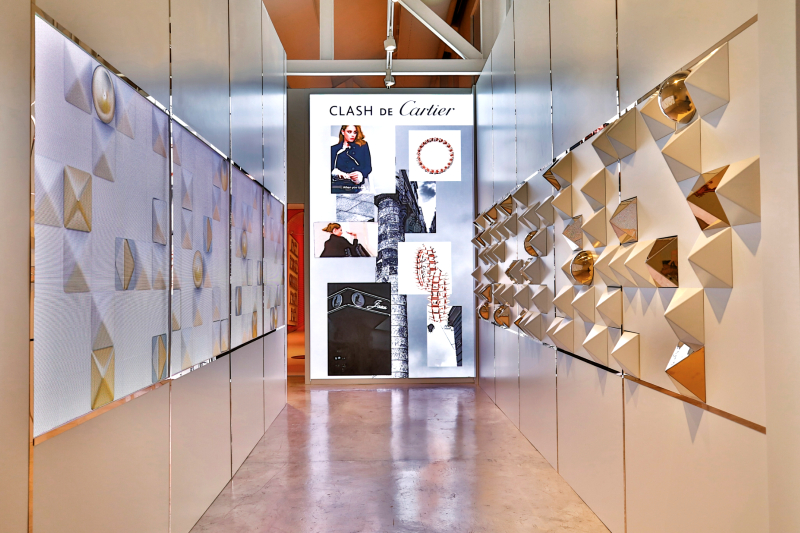
Panelling the walls throughout the venue were ornate gilded mirrors splashed with inscriptions such as “Gold save the queen” and “In Cartier we trust”. Just as popular with the Instagram crowd was the Clash Tunnel by Tiffany Godoy, a white corridor spiked with Clash motifs such as studs, beads and the pyramidal clous carrés.
The collection
Attitude, architectural ingenuity and the vibrant clash of cultures that defined the studio were hallmarks of the dichotomous Clash de Cartier line.
The maker of the iconic Crash timepiece revealed another disruptive concept in this new collection: rings, earrings, bracelets and necklaces embellished with studs that appear to be sharp and fixed in place, but in actuality are soft to the touch and dance when moved. Clinking gently and scattering light with its motion, the studs are held in place with minuscule magnets. The punk aesthetic is tempered by feminine curves and fluid contours, with bracelet and ring undersides scalloped for comfort. Executed in pink and yellow gold, the pieces beg to be mixed and matched and stacked.
tiffany_godoy_screen.jpg
Although the Clash de Cartier Studio lasted a mere three days, this showcase of its versatility and surprising fluency in the language of contradictions made a lingering impression. It takes an experienced house to make serious jewellery playful, and with that surreal meander through the pop-up project, Cartier proved that not only are rules made to be broken, but that nothing need be as it seems. After all, you do not build a 173-year-old legacy by being conventional.
This article first appeared on Feb 3, 2020 in The Edge Malaysia.


